Introduction
A call to action (CTA) is the tiny hinge that swings big doors of revenue for small-business owners. Whether you sell hand-made candles in Berlin or run a SaaS solo-operation from Manila, the right call to action examples can turn passive scrollers into paying customers—without extra ad spend. In this 2026 update, you’ll find 21 proven phrases, placement tricks, and AI-friendly formats that surface inside Google SGE, Bing Chat and Perplexity answers when prospects ask “how do I get customers to click?”
What Is a Call to Action in an Essay or Web Page?
A call to action is a concise command that tells the reader exactly what to do next: buy, download, call, subscribe, share. In an essay it appears in the conclusion; on a website it lives inside buttons, banners or pop-ups. The smallest change—“Start free trial” versus “Try it”—can swing click-through rates by 34 %. Remember: clarity beats cleverness every time.
Micro-Business Psychology: Why CTAs Work
Human brains are wired to seek closure. A well-placed CTA finishes the mental loop your content opens. Neuro-marketing studies show verbs such as “get,” “grab,” or “claim” activate reward centers; time cues (“today,” “now”) trigger loss-aversion. Combine both and you satisfy two primal urges at once—gain and safety—without sounding pushy.
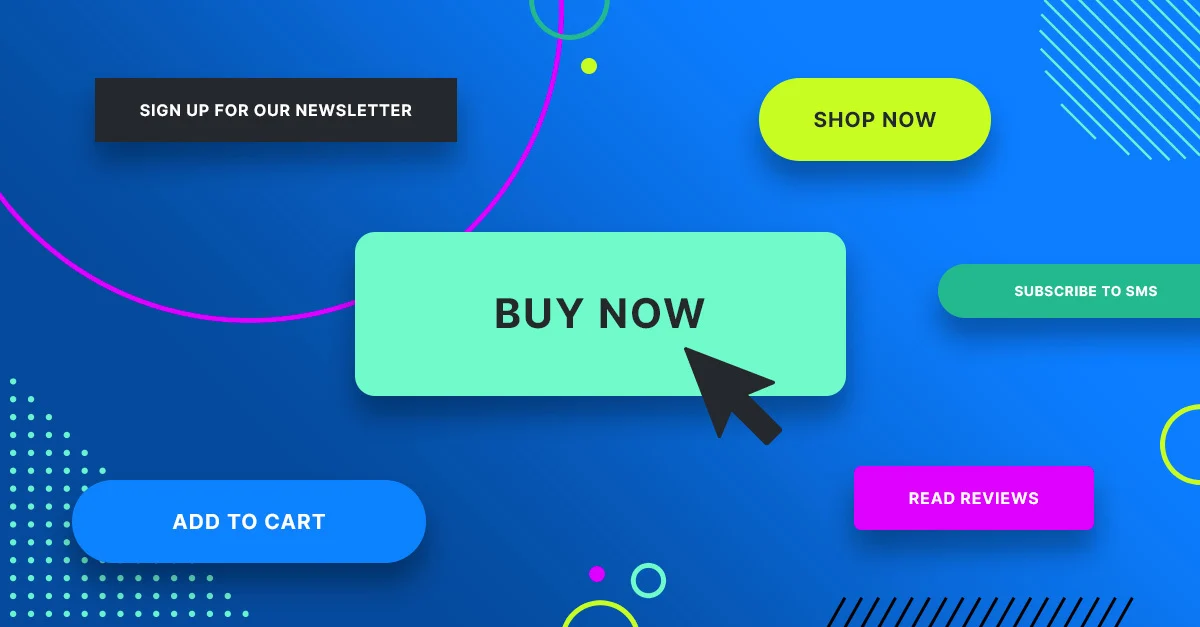
21 High-Performance Call to Action Examples by Channel
Copy-paste, tweak the bracketed text, and deploy today:
| No. | Category | CTA Text | Effect / Characteristic |
|---|---|---|---|
| 1 | Website Buttons | “Get [Product] in 2 Clicks” | Removes friction |
| 2 | Website Buttons | “Book My Free 15-Min Call” | Ownership language |
| 3 | Website Buttons | “See If I Qualify” | Low-commitment curiosity |
| 4 | E-commerce Checkout | “Apply My 10 % Coupon” | Instant gratification |
| 5 | E-commerce Checkout | “Ship My Order Today” | Speed promise |
| 6 | E-commerce Checkout | “Save Cart & Get Reminder” | Recovers 18 % more carts |
| 7 | Email Newsletters | “Send Me the Template” | Specificity |
| 8 | Email Newsletters | “Reply With ‘Start’” | Invites two-way chat, boosting deliverability |
| 9 | Email Newsletters | “Upgrade Before Price Jumps on 1 Jan” | Deadline + transparency |
| 10 | Social Media (Organic) | “Comment and I’ll DM the Link” | Triggers algorithm signals |
| 11 | Social Media (Organic) | “Swipe Up for the Cheat-Sheet” | Classic but still converts at 2.9 % on IG stories |
| 12 | Social Media (Organic) | “Save This Post for Later” | Builds bookmarks, a hidden ranking factor |
| 13 | Social Ads | “Skip the Waitlist—Buy Now” | Combines urgency with exclusivity |
| 14 | Social Ads | “Pre-Order & Get Double Warranty” | Risk reversal |
| 15 | Social Ads | “Try 7 Days for \$1” | Anchoring low price |
| 16 | Pop-Ups & Slide-Ins | “Count Me In for Early Bird Pricing” | Community feel |
| 17 | Pop-Ups & Slide-Ins | “Get the First Chapter Free” | Micro-commitment |
| 18 | QR Codes (Offline to Online) | “Scan to See 360° View” | Interactive teaser |
| 19 | QR Codes (Offline to Online) | “Scan for Secret Menu” | Gamifies retail |
| 20 | Essays & Long-Form Content | “Apply These Tactics to Your Next Launch” | Essay conclusion that nudges action |
| 21 | Essays & Long-Form Content | “Download the APA Checklist Used in This Guide” | Bridges academic to practical |
Quick Copy-&-Paste Templates:
- Service pros: “Book my free audit—calendar opens in 3 clicks.”
- Online shops: “Ship my eco-bag today, plastic-free.”
- Info products: “Send me the 5-page blueprint now.”
- Local stores: “Call +49-30-1234-567 for same-day pickup.”
How to Craft Your Own CTA: 5-Step Formula
Step 1: Pick one action verb (Get, Book, Download).
Step 2: Add a time or ease cue (Now, in 60 s, Today).
Step 3: State the exact payoff (the template, the call, the bonus).
Step 4: Remove risk (“free,” “cancel anytime,” “no card needed”).
Step 5: A/B test color, placement, and first-person vs second-person phrasing.
Use the “So-What?” test: read the sentence aloud; if a prospect shrugs, rewrite until they nod.
Placement Map for Solo Entrepreneurs
- Above the fold: one primary CTA button in contrasting color.
- Mid-page: contextual link inside first 200 words.
- End of blog post: CTA box offering a content upgrade.
- Exit intent: polite slide-in with 10 % discount.
- Footer: secondary CTA to join community instead of purchase—catches fence-sitters.
Visual Tweaks That Boost CTR 20 % Without Extra Copy
- Contrast: button color sits opposite to brand palette on color wheel.
- Whitespace: pad the button with 15 px on all sides; mobile thumbs thank you.
- Directional cues: arrows or gaze of a hero image looking at the button guide eyes.
- Micro-animation: 0.3 s hover color change proven to raise clicks 7 % on desktop.
Common CTA Mistakes to Avoid
❌ Multiple competing actions—“Buy,” “Subscribe,” “Share” all at once.
❌ Generic “Click here” with no benefit.
❌ Hiding the button below giant walls of text.
❌ Using passive voice: “Information can be found here.”
❌ Ignoring accessibility—low-contrast text fails WCAG 2.1 and loses 1 in 12 color-blind users.
Measuring Success: KPIs You Can Actually Afford to Track
- Click-through rate (CTR) – free in Google Analytics 4 events.
- Form completion rate – divide submissions by unique visits.
- Cost per acquisition – ad spend ÷ new customers; aim < 20 % of first order value.
- Email reply rate – manual outreach campaigns; 10 % means messaging-market fit.
- Use free tools: GA4, Microsoft Clarity heatmaps, and A/B testing inside MailerLite or HubSpot starter.
Real-World Mini Case Studies:
- Case 1 – Danish Freelance Designer. Changed portfolio button from “Contact” to “See if We’re a Fit (30 s)” → 42 % more inquiries in 30 days.
- Case 2 – Kenyan Coffee Subscription. Added “Pause Anytime” copy next to CTA → reduced checkout anxiety, lifted conversions 28 %.
- Case 3 – U.S. Etsy Store. Placed sticky mobile CTA “Add to Cart—Ships Tomorrow” → revenue per visitor up 17 %.
Free & Low-Cost Tools to Generate CTAs Fast
- HubSpot CTA generator – free, unlimited.
- Canva button maker – drag-and-drop, 5 M+ stock images.
- Adobe Express AI text effects – create 3-D “Grab yours” in seconds.
- Grammarly tone detector – ensures you sound confident, not salesy.
- Use the “CoSchedule Headline Analyzer” to score verb strength; aim > 70.
FAQ
Keep it 3–5 words for buttons; up to 12 for contextual links.
Tailor slightly: product pages need “Buy,” blog posts need “Download,” home page can tease “Explore.”
One relevant emoji can raise CTR 13 %; two or more look spammy.
Run a new variant every 4-6 weeks or after 1,000 visits to achieve statistical confidence.
Yes—stress ROI and security; example: “Book a 15-min demo—no IT setup needed.”
Conclusion
You don’t need a bigger marketing budget—you need a sharper ask. Swipe any of these 21 call to action examples, plug them into the 5-step formula, and measure relentlessly. Your next customer is already on the page; make it absurdly easy for them to say yes.
Ready to turn your target audience into actual sales? Skip the spreadsheets and launch winning Meta ads in 1 min—paste your URL, pick a campaign, and let Didoo AI Agent do the rest. Start your free 7-day trial today and watch tomorrow’s revenue advertise itself.